Featured products
Blog
Article #3
Lorem ipsum dolor sit amet, consectetur adipiscing elit. Cras id gravida est. Sed nibh eros, pharetra nec...
Article #2
Lorem ipsum dolor sit amet, consectetur adipiscing elit. Cras id gravida est. Sed nibh eros, pharetra nec...
Article #1
Lorem ipsum dolor sit amet, consectetur adipiscing elit. Cras id gravida est. Sed nibh eros, pharetra nec...
Newest products
Sale
SEOnista!
New: SEOnista by OOSEOO! Optimized loading time and Out of the Box design
Back to the roots with focus on the customer experience and a high success rate combined with an out of the box design. A webshop’s design should obviously be outstanding, but did you know that a good design often completely disagrees with the highest possible conversion rate? Don’t miss out on any more orders with the SEOnista theme!
The most important SEOnista features:- Optimized loading time
- Unique conversion boosting side-navigation
- Related products sliders
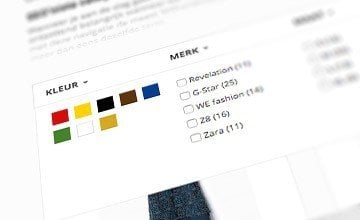
- Visual colour filter
- Call to action timer on product pages (e.g. order within 1 hour 51 minutes to receive next day delivery)
- Several lay-out options for homepage
- ‘Shop now’ feature for easy shopping
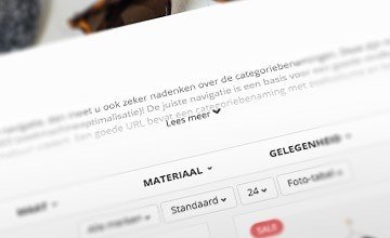
- ‘Read more’ feature on category pages and homepage
- Icons in front of categories
- Fully responsive
- And of course all successful features from our other themes
There are several SEOnista presets to give you an idea of all the different possibilities. These are the available presets:
Standard: http://seonista.webshopapp.com/en/
Cooking: http://seonista-preset-cooking.webshopapp.com/en/
Living: http://seonista-preset-living.webshopapp.com/en/
You can find the theme manual here: http://www.ooseoo.com/category/handleidingen/Optimized for better loading times
This is not only important for Google. Good loading times also make a webshop user-friendly. We’ve optimized all possible elements within the SEOnista theme to improve loading times. Some elements, images and files will only be loaded at the moment they are actually need to avoid unnecessary waiting
Navigation is the key to success
What makes a webshop successful? Potential customers should be able to easily find what they are looking for. The possibilities for navigation are therefore crucial for success and the navigation should always be clearly visible. That’s why we have chosen to remove the standard horizontal navigation bar and to place the navigation on the left side of the screen. This is intuitively the best and most user-friendly position.
By separating the navigation from the rest of the design customers know on which page of your shop they are located and where they can find your products. The fact that the filters are also shown separately makes this layout even better. Everything is in place at all times to make sure your visitors turn into paying customers!
Perfect for SEO
Because of the fact that the navigation is now very prominent and that its position is fixed you will have to find the right way to categorize your products in your navigation structure. This makes it almost automatically seo-friendly!
Product pages that convert
Important elements and Unique Selling Points should always be clearly visible. However, it is not just the position of these elements that is important, the order in which the elements are places should also be considered.
Within the SEOnista theme the most important elements en USPs are always visible when it matters most. Your visitors will first see the product and then the reason they should buy it at your shop and not the other way around. We believe this order makes much more sense.
OOSEOO’s experience and expertise
As an e-Commerce specialist with a lot of customers making use of the SEOshop platform we know like no other which design works, what drives conversion and what doesn’t. As a Google Partner OOSEOO has conquered a top 25 spot for agencies in the Benelux. This knowledge combined with our in-house experts on design and development of webshops on the SEOshop platform has lead us to the new SEOnista theme.
SEOnista is purely based on our own expertise and years of experience. We didn’t just focus on the design, but also on the online marketing aspects. And you know what? The first and at one point only theme by SEOshop itself is still the theme that is most likely to convert!
If you have any questions or if you require any assistance when installing the SEOnista theme please contact our development team at [email protected] or +31 (0)33 – 76 00 110.

 Home
Home T-Shirt
 Shirts
 Sweatshirts
 Suits
Suits Coats & Jackets
 Jeans
Jeans Shorts
 Footwear
 Bags & Accessories
 Sale
Sale Blog
Blog Bon Prix
 Esprit
 G-Star
 KOOKAI
 Mexx
Mexx No-l-ita
 Revelation
 Revelation Kids
 WE
WE Zara
Zara


